맥OS 환경에서 RStudio에 관련된 문제 중 하나는 '한글 인코딩'입니다.

개발자가 아니라서 자세한 이유는 잘 모르지만, 


아무튼 R공부를 하는 중에 readLines()함수를 이용해 txt 파일을 불러올 때

한글이 제대로 불러와지지 않는 문제가 발생합니다.


> txt <- readLines("test.txt")

Warning message:

In readLines("test.txt") : incomplete final line found on 'test.txt'

> head(txt)

[1] "\"\xba\xb8\xb0\xed \xbdʹ\xd9"                                           

[2] "\xc0̷\xb8\xb0\xd4 \xb8\xbb\xc7ϴϱ\xee \xb4\xf5 \xba\xb8\xb0\xed \xbdʹ\xd9"

[3] "\xb3\xca\xc8\xf1 \xbb\xe7\xc1\xf8\xc0\xbb \xba\xb8\xb0\xed \xc0־"      

[4] "\xba\xb8\xb0\xed \xbdʹ\xd9"                                             

[5] "\xb3ʹ\xab \xbe\u07fc\xd3\xc7\xd1 \xbdð\xa3"                             

[6] "\xb3\xaa\xb4\xc2 \xbf츮\xb0\xa1 \xb9Ӵ\xd9" 


검색을 통해 알아낸 방법들로

파일을 불러올 때 옵션으로 인코딩을 지정한다던가,

txt 파일을 새로 만들면서 'UTF-8' 혹은 'euc-kr'으로 저장하는 방법을 사용해보기도 했지만

저는 제대로 해결되지 않았어요.


아무튼 어떻게 해결 했냐면, 일단 RStudio 자체의 인코딩 인식과 방법에 관련된 문제이지 싶어서

RStudio에서 txt 파일을 생성해 저장함으로써 간단하게 해결했습니다.


자세한 원리는 모르겠지만...

RStudio 환경에서 생성하면 사용가능한 인코딩으로 저장되지 않을까? 하는 생각으로 시도했는데 먹혀들었네요ㅎㅎ

환경설정에서 확인해 봤을 땐 system default가 UTF-8이던데

어째서 txt 파일을 UTF-8 인코딩으로 저장했을 때도 같은 문제가 발생했는지는 모르겠지만요...


Posted by Azel.Kim :

머신러닝?

2017. 8. 3. 17:08 from 통계/데이터 마이닝

머신러닝?

: 주어진 입력 데이터를 컴퓨터 프로그램이 학습하여 예측을 수행하고 스스로의 예측 성능을 향상시키는 과정과 이를 위한 알고리즘을 연구하고 구축하는 기술

cf. 데이터마이닝

: 대규모로 저장된 데이터 안에서 체계적이고 자동적으로 의미 있는 규칙이나 패턴을 발견하고 이를 지식화하는 과정


머신러닝 카테고리

1) 지도학습 Supervised Learning

입력(input)에 대한 결과(output)를 알고 있는 데이터를 분석하여 함수화하거나 분류하여

새로운 데이터(목표변수, 종속변수)를 예측하는 방법

ex) 텍스트 인식, 사진 인식, 신용평가, 의사결정나무, 판별분석, 회귀분석 등


2) 비지도학습 Unsupervised Learning

입력(input)에 대한 결과(output)가 없는 데이터들을 분석하여 연관짓는다.

ex) 군집분석, 연관성분석, 연관성규칙발견 등


3) 강화학습 Reinforcement Learning

게임을 진행하면서 승리, 패배시 보상과 패널티를 주면서 학습시킨다.

ex) 알파고

Posted by Azel.Kim :

참고: 추천시스템(PR시리즈) http://bahnsville.tistory.com/895


1. 추천시스템의 기본원리는 "과거는 곧 미래다."
추천을 위해 필요한 데이터는 유저들의 행위 behavior 기록이다.
ex> 제품이나 컨텐츠에 대한 사용자의 선호/관심의 지표(상품 구매 이력, 이벤트 참석 이력, 평점 등의 유저 레이팅)


2. 추천시스템에서 사용되는 데이터는?

1) 명시적 레이팅(explicit rating)암묵적 점수(implicit feedback) in 유저 레이팅

- 명시적 레이팅은 평범/별점 등 구체적인 스케일로 점수를 매긴 것
- 암묵적 점수는 조회여부(0/1), 구매여부(0/1) 처럼 명시적으로 점수화하지 못하는 것
- 명시적 레이팅은 점수의 편향이 있거나, 존재하지 않는 경우가 암묵적 점수보다 더 많은 편
- 그래서 암묵적 점수를 더 많이 사용하는 추세

2) 추천시스템에서 해결해야할 가장 큰 문제는 데이터의 크기(data dimensionality) 문제


3. 추천 대상에 따른 추천시스템 분류

- 전체 추천: 불특정 다수에게 추천하는 형태 (ex: 검색엔진 사이트의 메인화면에서 보여지는 다수의 글/이미지/상품들, 추천 검색어, 실시간 검색어 등)

- 그룹 추천: 사용자들을 특정 세그먼트(그룹)으로 나누어서 각 그룹에 특화된 컨텐츠 추천하는 형태 (ex:성/연령별 선호 상품, 기사, 키워드)

- 개인추천(개인화): 개인의 과거 이력을 바탕으로 개인의 관심사를 특정하고 그에 맞는 아이템 추천하는 형태. "사용자를 어떻게 모델링(프로파일링) 할 것인가?"가 핵심

- 연관 아이템 추천: 맞춤추천이 아니라 개별 아이템별로 관련 아이템을 보여주는 형태 (ex: 최근 본 상품 탭, 유튜브 연관 동영상 등)


4. 추천 알고리즘에 따른 추천시스템 분류
- 협업 필터링(Collaborative Filtering)

1) 모델 기반 CF : 머신러닝 활용

2) 메모리 기반 CF : 유저-아이템 레이팅을 모두 메모리에 올려두고 유저-유저/아이템-아이템 관계(유사도)를 계산하기 때문에 메모리 기반이라고 불림

1> 제품-제품 협업 필터링: 사용가자 구매한 것과 가장 유사한 다른 제품 추천

2> 사용자-사용자 협업 필터링: 유사 사용자가 구매한 것과 가장 유사한 제품을 추천

*유사도(관계) 측정: 동시발생, 쟈카드 인덱스, 유클리디안 거리 등...

3) MF(Matrix Facrtorization) 방식 : 유저-아이템 레이팅을 메트릭스에서 고유벡터(eigen vector)를 구해 행렬을 분해하는 SVD(Singular value decomposition) 이용 -> 데이터의 크기(data dimensionality) 문제를 해결하기 위한 방법....이라는데 matrix 연산을 위한 메모리 감당이 어려움


- 컨텐츠 기반 필터링(Content-based Filtering)
: 유저 프로파일 혹은 제품(컨텐츠) 프로파일 정보를 활용하여 추천

장점: 알고리즘이 매우 직관적이고 쉬움

단점: 추천되는 아이템이 너무 뻔함


Posted by Azel.Kim :

출처 : http://blog.naver.com/ilustion/220257419444


## 주성분분석

# princomp(x, cor=T) 함수를 사용

# x는 n X p 다변량 자료행렬이고, cor=T이면 상관행렬분해를, cor=F이면 공분산행렬분해를 지시

# 주성분 점수는 scores에, 주성분 부하는 loadings에 남는다

protein=read.table("J:/R을 활용한 탐색적 자료분석/protein.txt", header=TRUE)

str(protein)

'data.frame':   25 obs. of  10 variables:

 $ Country: Factor w/ 25 levels "Albania","Austria",..: 1 2 3 4 5 6 7 8 9 10 ...

 $ Beef   : num  10.1 8.9 13.5 7.8 9.7 10.6 8.4 9.5 18 10.2 ...

 $ Chicken: num  1.4 14 9.3 6 11.4 10.8 11.6 4.9 9.9 3 ...

 $ Egg    : num  0.5 4.3 4.1 1.6 2.8 3.7 3.7 2.7 3.3 2.8 ...

 $ Milk   : num  8.9 19.9 17.5 8.3 12.5 25 11.1 33.7 19.5 17.6 ...

 $ Fish   : num  0.2 2.1 4.5 1.2 2 9.9 5.4 5.8 5.7 5.9 ...

 $ Cereal : num  42.3 28 26.6 56.7 34.3 21.9 24.6 26.3 28.1 41.7 ...

 $ Potato : num  0.6 3.6 5.7 1.1 5 4.8 6.5 5.1 4.8 2.2 ...

 $ Bean   : num  5.5 1.3 2.1 3.7 1.1 0.7 0.8 1 2.4 7.8 ...

 $ Fruit  : num  1.7 4.3 4 4.2 4 2.4 3.6 1.4 6.5 6.5 ...


pca=princomp(protein[,2:10], cor=T)

names(pca)

pca$loadings[,1:2]

pca$scores[,1:2]

attach(pca)

plot(scores[,2]~scores[,1], main="Principal Component Space",

     xlim=c(-5,5), ylim=c(-5,5))

text(y=scores[,2], x=scores[,1], label=protein$Country, cex=0.8)


plot(loadings[,2]~loadings[,1], main="Principal Component Loadings",

     xlim=c(-1,1), ylim=c(-1,1))

text(y=loadings[,2], x=loadings[,1], label=colnames(protein[,2:10]),cex=0.8)

for(i in 1:9){

  arrows(0, 0, 0.8*loadings[i,1], 0.8*loadings[i,2], length=0.1)

}

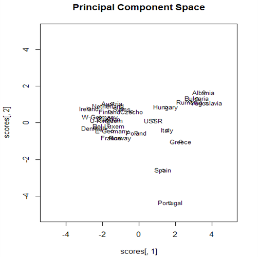
대다수의 나라들이 왼쪽에 군집을 이루가 있으나 오른쪽위에 알바니아, 불가리아, 루마니아, 유고슬라비아등 4개국이 진을 치고 있다. 관측개체 플롯내 위치와 변수 플롯의 곡류 위치가 대응하므로 이들 나라들은 곡류 섭취로 특성화된다. 아래 오른쪽에 스페인과 포르투갈이 있는데 이들은 생선, 콩, 과일 섭취로 특성화된다

그리스와 이탈리아는 콩 섭취와 관련이 깊다고 할 수 있다. 


Posted by Azel.Kim :

출처 : http://gastonsanchez.com/how-to/2012/06/17/PCA-in-R/


5 functions to do Principal Components Analysis in R

Principal Component Analysis (PCA) is a multivariate technique that allows us to summarize the systematic patterns of variations in the data.

From a data analysis standpoint, PCA is used for studying one table of observations and variables with the main idea of transforming the observed variables into a set of new variables, the principal components, which are uncorrelated and explain the variation in the data. For this reason, PCA allows to reduce a “complex” data set to a lower dimension in order to reveal the structures or the dominant types of variations in both the observations and the variables.

PCA in R

In R, there are several functions from different packages that allow us to perform PCA. In this post I’ll show you 5 different ways to do a PCA using the following functions (with their corresponding packages in parentheses):

  • prcomp() (stats)
  • princomp() (stats)
  • PCA() (FactoMineR)
  • dudi.pca() (ade4)
  • acp() (amap)

Brief note: It is no coincidence that the three external packages ("FactoMineR""ade4", and "amap") have been developed by French data analysts, which have a long tradition and preference for PCA and other related exploratory techniques.

No matter what function you decide to use, the typical PCA results should consist of a set of eigenvalues, a table with the scores or Principal Components (PCs), and a table of loadings (or correlations between variables and PCs). The eigenvalues provide information of the variability in the data. The scores provide information about the structure of the observations. The loadings (or correlations) allow you to get a sense of the relationships between variables, as well as their associations with the extracted PCs.

The Data

To make things easier, we’ll use the dataset USArrests that already comes with R. It’s a data frame with 50 rows (USA states) and 4 columns containing information about violent crime rates by US State. Since most of the times the variables are measured in different scales, the PCA must be performed with standardized data (mean = 0, variance = 1). The good news is that all of the functions that perform PCA come with parameters to specify that the analysis must be applied on standardized data.

Option 1: using prcomp()

The function prcomp() comes with the default "stats"package, which means that you don’t have to install anything. It is perhaps the quickest way to do a PCA if you don’t want to install other packages.

# PCA with function prcomp
pca1 = prcomp(USArrests, scale. = TRUE)

# sqrt of eigenvalues
pca1$sdev
## [1] 1.5749 0.9949 0.5971 0.4164
# loadings
head(pca1$rotation)
##              PC1     PC2     PC3      PC4
## Murder   -0.5359  0.4182 -0.3412  0.64923
## Assault  -0.5832  0.1880 -0.2681 -0.74341
## UrbanPop -0.2782 -0.8728 -0.3780  0.13388
## Rape     -0.5434 -0.1673  0.8178  0.08902
# PCs (aka scores)
head(pca1$x)
##                PC1     PC2      PC3      PC4
## Alabama    -0.9757  1.1220 -0.43980  0.15470
## Alaska     -1.9305  1.0624  2.01950 -0.43418
## Arizona    -1.7454 -0.7385  0.05423 -0.82626
## Arkansas    0.1400  1.1085  0.11342 -0.18097
## California -2.4986 -1.5274  0.59254 -0.33856
## Colorado   -1.4993 -0.9776  1.08400  0.00145

Option 2: using princomp()

The function princomp() also comes with the default "stats" package, and it is very similar to her cousin prcomp(). What I don’t like of princomp() is that sometimes it won’t display all the values for the loadings, but this is a minor detail.

# PCA with function princomp
pca2 = princomp(USArrests, cor = TRUE)

# sqrt of eigenvalues
pca2$sdev
## Comp.1 Comp.2 Comp.3 Comp.4 
## 1.5749 0.9949 0.5971 0.4164
# loadings
unclass(pca2$loadings)
##           Comp.1  Comp.2  Comp.3   Comp.4
## Murder   -0.5359  0.4182 -0.3412  0.64923
## Assault  -0.5832  0.1880 -0.2681 -0.74341
## UrbanPop -0.2782 -0.8728 -0.3780  0.13388
## Rape     -0.5434 -0.1673  0.8178  0.08902
# PCs (aka scores)
head(pca2$scores)
##             Comp.1  Comp.2   Comp.3    Comp.4
## Alabama    -0.9856  1.1334 -0.44427  0.156267
## Alaska     -1.9501  1.0732  2.04000 -0.438583
## Arizona    -1.7632 -0.7460  0.05478 -0.834653
## Arkansas    0.1414  1.1198  0.11457 -0.182811
## California -2.5240 -1.5429  0.59856 -0.341996
## Colorado   -1.5146 -0.9876  1.09501  0.001465

Option 3: using PCA()

A highly recommended option, especially if you want more detailed results and assessing tools, is the PCA() function from the package "FactoMineR". It is by far the best PCA function in R and it comes with a number of parameters that allow you to tweak the analysis in a very nice way.

# PCA with function PCA
library(FactoMineR)

# apply PCA
pca3 = PCA(USArrests, graph = FALSE)

# matrix with eigenvalues
pca3$eig
##        eigenvalue percentage of variance cumulative percentage of variance
## comp 1     2.4802                 62.006                             62.01
## comp 2     0.9898                 24.744                             86.75
## comp 3     0.3566                  8.914                             95.66
## comp 4     0.1734                  4.336                            100.00
# correlations between variables and PCs
pca3$var$coord
##           Dim.1   Dim.2   Dim.3    Dim.4
## Murder   0.8440 -0.4160  0.2038  0.27037
## Assault  0.9184 -0.1870  0.1601 -0.30959
## UrbanPop 0.4381  0.8683  0.2257  0.05575
## Rape     0.8558  0.1665 -0.4883  0.03707
# PCs (aka scores)
head(pca3$ind$coord)
##              Dim.1   Dim.2    Dim.3     Dim.4
## Alabama     0.9856 -1.1334  0.44427  0.156267
## Alaska      1.9501 -1.0732 -2.04000 -0.438583
## Arizona     1.7632  0.7460 -0.05478 -0.834653
## Arkansas   -0.1414 -1.1198 -0.11457 -0.182811
## California  2.5240  1.5429 -0.59856 -0.341996
## Colorado    1.5146  0.9876 -1.09501  0.001465

Option 4: using dudi.pca()

Another option is to use the dudi.pca() function from the package "ade4" which has a huge amount of other methods as well as some interesting graphics.

# PCA with function dudi.pca
library(ade4)

# apply PCA
pca4 = dudi.pca(USArrests, nf = 5, scannf = FALSE)

# eigenvalues
pca4$eig
## [1] 2.4802 0.9898 0.3566 0.1734
# loadings
pca4$c1
##              CS1     CS2     CS3      CS4
## Murder   -0.5359  0.4182 -0.3412  0.64923
## Assault  -0.5832  0.1880 -0.2681 -0.74341
## UrbanPop -0.2782 -0.8728 -0.3780  0.13388
## Rape     -0.5434 -0.1673  0.8178  0.08902
# correlations between variables and PCs
pca4$co
##            Comp1   Comp2   Comp3    Comp4
## Murder   -0.8440  0.4160 -0.2038  0.27037
## Assault  -0.9184  0.1870 -0.1601 -0.30959
## UrbanPop -0.4381 -0.8683 -0.2257  0.05575
## Rape     -0.8558 -0.1665  0.4883  0.03707
# PCs
head(pca4$li)
##              Axis1   Axis2    Axis3     Axis4
## Alabama    -0.9856  1.1334 -0.44427  0.156267
## Alaska     -1.9501  1.0732  2.04000 -0.438583
## Arizona    -1.7632 -0.7460  0.05478 -0.834653
## Arkansas    0.1414  1.1198  0.11457 -0.182811
## California -2.5240 -1.5429  0.59856 -0.341996
## Colorado   -1.5146 -0.9876  1.09501  0.001465

Option 5: using acp()

A fifth possibility is the acp() function from the package "amap".

# PCA with function acp
library(amap)

# apply PCA
pca5 = acp(USArrests)

# sqrt of eigenvalues
pca5$sdev
## Comp 1 Comp 2 Comp 3 Comp 4 
## 1.5749 0.9949 0.5971 0.4164
# loadings
pca5$loadings
##          Comp 1  Comp 2  Comp 3   Comp 4
## Murder   0.5359  0.4182 -0.3412  0.64923
## Assault  0.5832  0.1880 -0.2681 -0.74341
## UrbanPop 0.2782 -0.8728 -0.3780  0.13388
## Rape     0.5434 -0.1673  0.8178  0.08902
# scores
head(pca5$scores)
##             Comp 1  Comp 2   Comp 3   Comp 4
## Alabama     0.9757  1.1220 -0.43980  0.15470
## Alaska      1.9305  1.0624  2.01950 -0.43418
## Arizona     1.7454 -0.7385  0.05423 -0.82626
## Arkansas   -0.1400  1.1085  0.11342 -0.18097
## California  2.4986 -1.5274  0.59254 -0.33856
## Colorado    1.4993 -0.9776  1.08400  0.00145

Of course these are not the only options to do a PCA, but I’ll leave the other approaches for another post.

PCA plots

Everybody uses PCA to visualize the data, and most of the discussed functions come with their own plot functions. But you can also make use of the great graphical displays of "ggplot2". Just to show you a couple of plots, let’s take the basic results from prcomp().

Plot of observations

# load ggplot2
library(ggplot2)

# create data frame with scores
scores = as.data.frame(pca1$x)

# plot of observations
ggplot(data = scores, aes(x = PC1, y = PC2, label = rownames(scores))) +
  geom_hline(yintercept = 0, colour = "gray65") +
  geom_vline(xintercept = 0, colour = "gray65") +
  geom_text(colour = "tomato", alpha = 0.8, size = 4) +
  ggtitle("PCA plot of USA States - Crime Rates")

center

Circle of correlations

# function to create a circle
circle <- function(center = c(0, 0), npoints = 100) {
    r = 1
    tt = seq(0, 2 * pi, length = npoints)
    xx = center[1] + r * cos(tt)
    yy = center[1] + r * sin(tt)
    return(data.frame(x = xx, y = yy))
}
corcir = circle(c(0, 0), npoints = 100)

# create data frame with correlations between variables and PCs
correlations = as.data.frame(cor(USArrests, pca1$x))

# data frame with arrows coordinates
arrows = data.frame(x1 = c(0, 0, 0, 0), y1 = c(0, 0, 0, 0), x2 = correlations$PC1, 
    y2 = correlations$PC2)

# geom_path will do open circles
ggplot() + geom_path(data = corcir, aes(x = x, y = y), colour = "gray65") + 
    geom_segment(data = arrows, aes(x = x1, y = y1, xend = x2, yend = y2), colour = "gray65") + 
    geom_text(data = correlations, aes(x = PC1, y = PC2, label = rownames(correlations))) + 
    geom_hline(yintercept = 0, colour = "gray65") + geom_vline(xintercept = 0, 
    colour = "gray65") + xlim(-1.1, 1.1) + ylim(-1.1, 1.1) + labs(x = "pc1 aixs", 
    y = "pc2 axis") + ggtitle("Circle of correlations")

center


Posted by Azel.Kim :